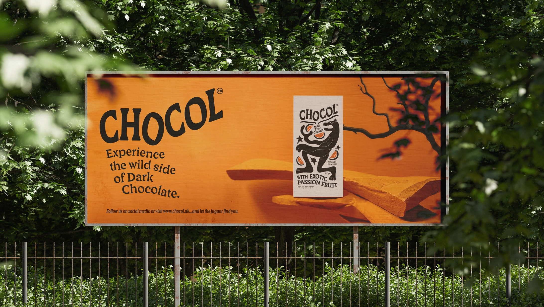

The challenge was designing a Deluxe holiday edition for Chocol without betraying the brand's identity.
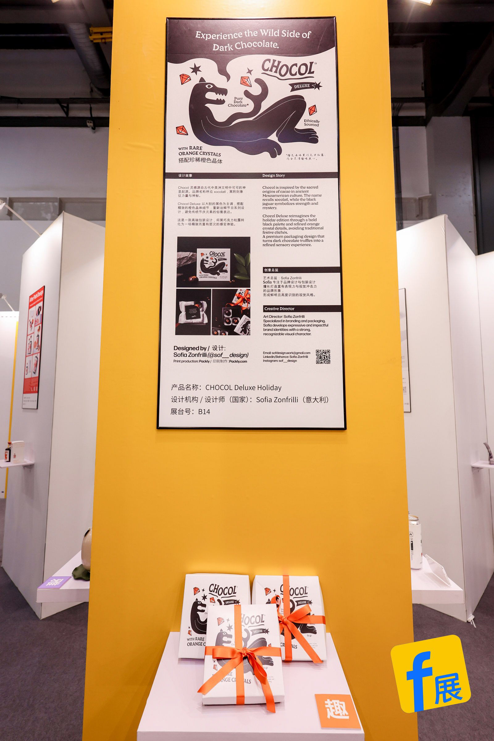
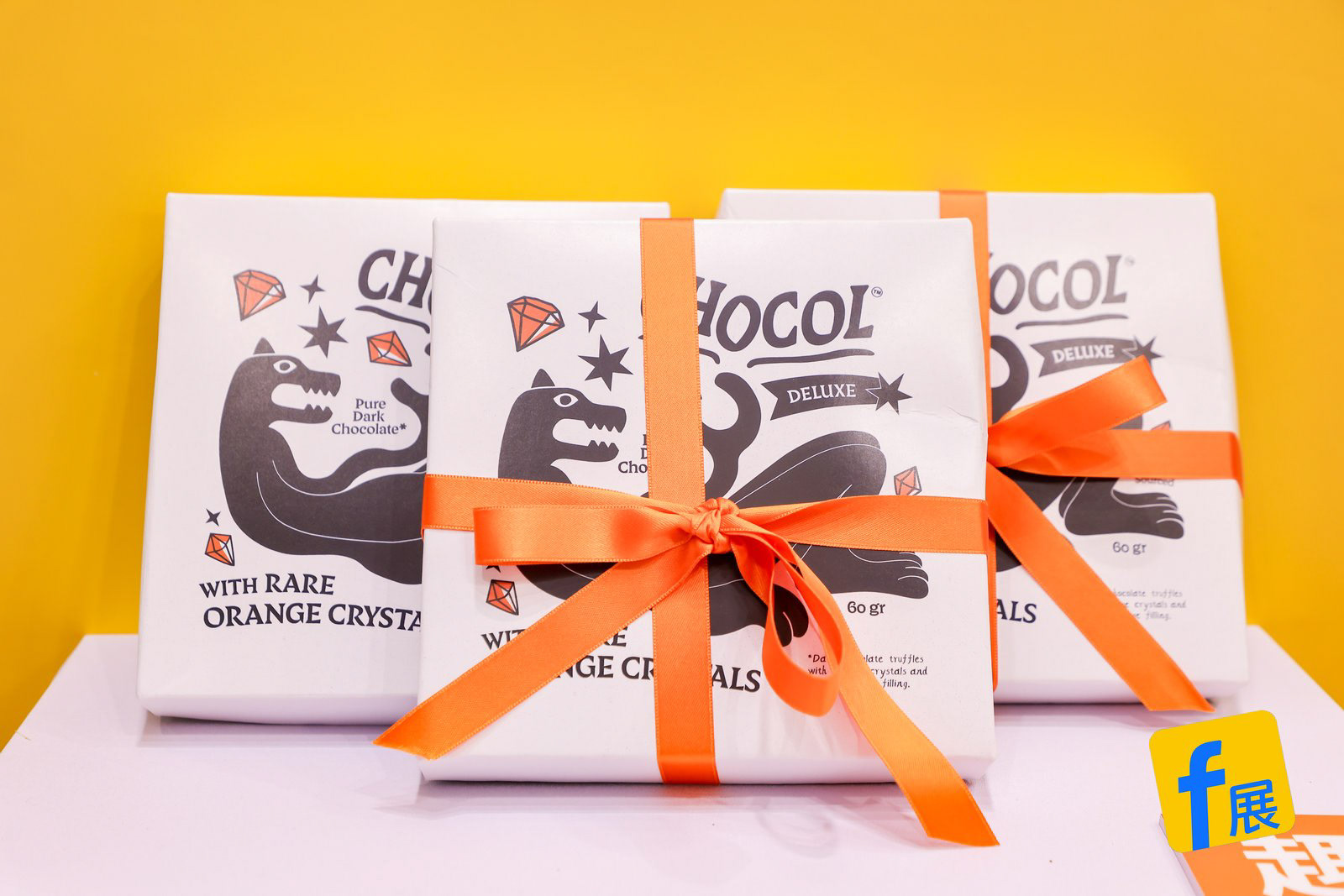
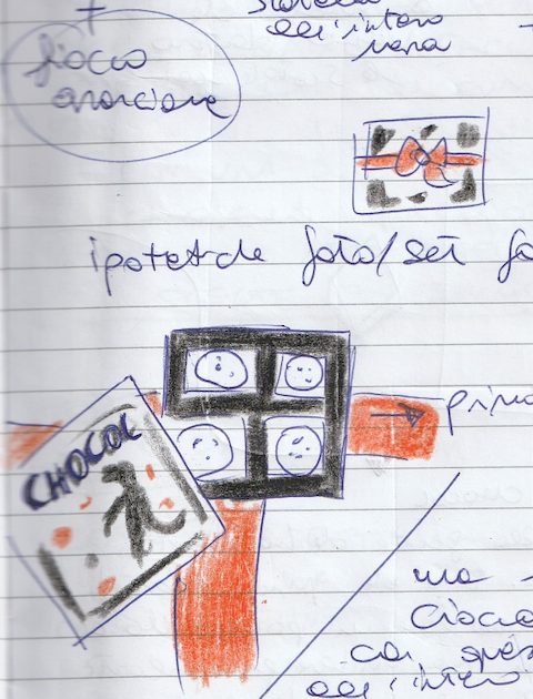
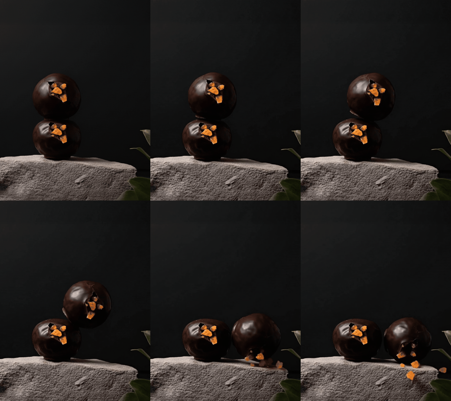
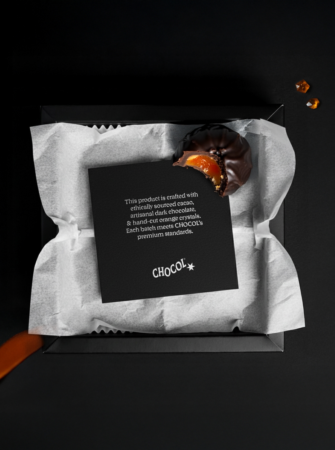
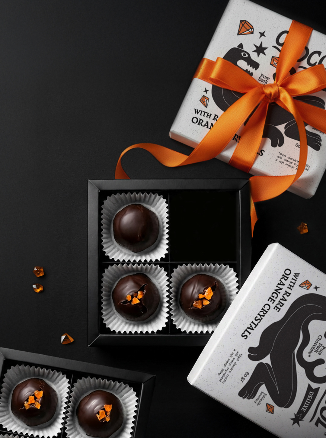
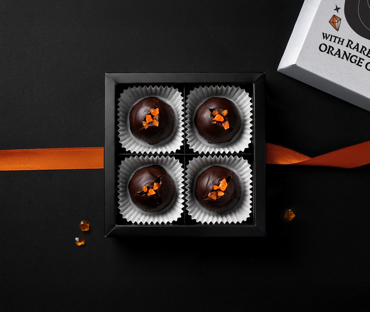
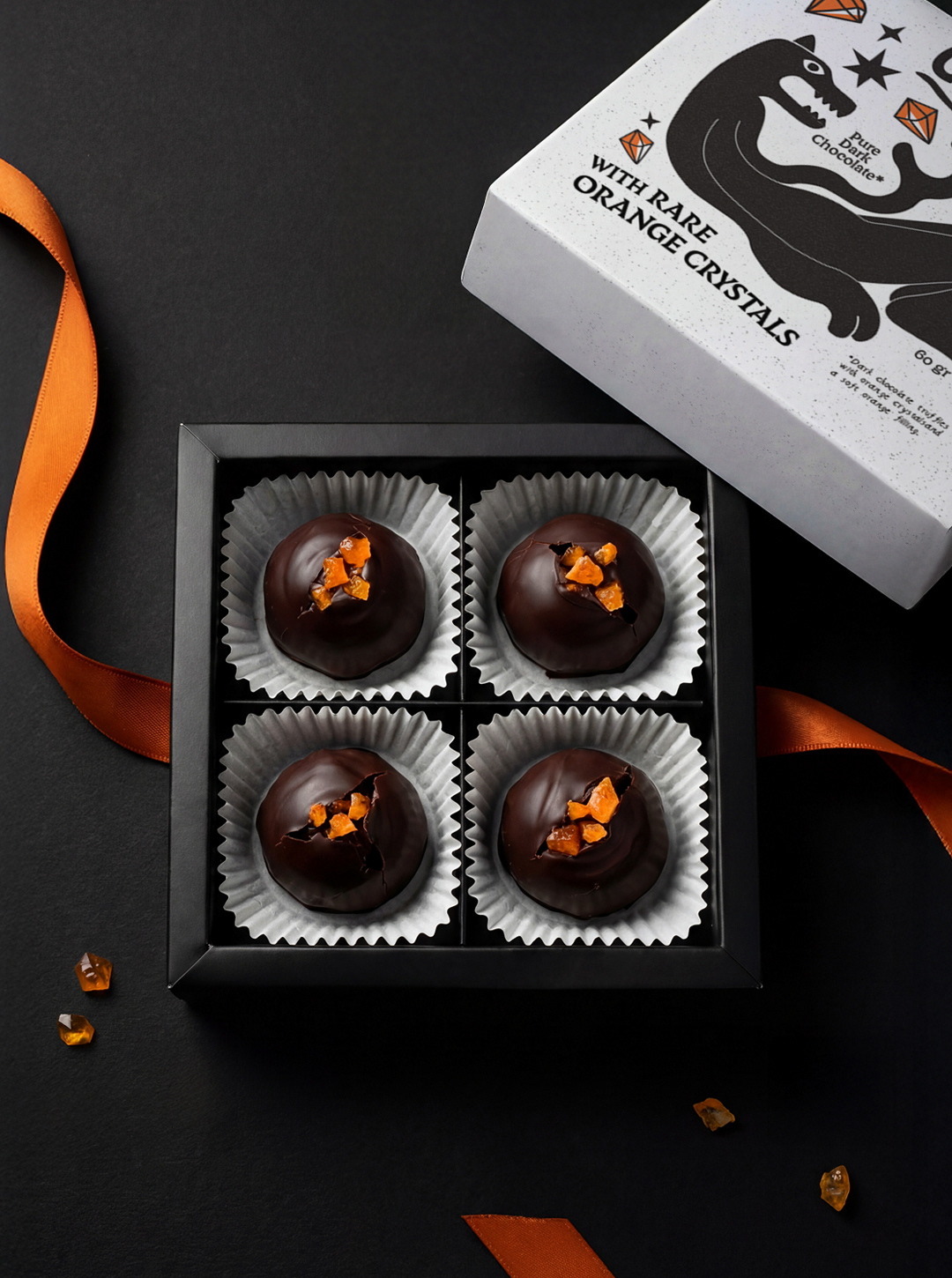
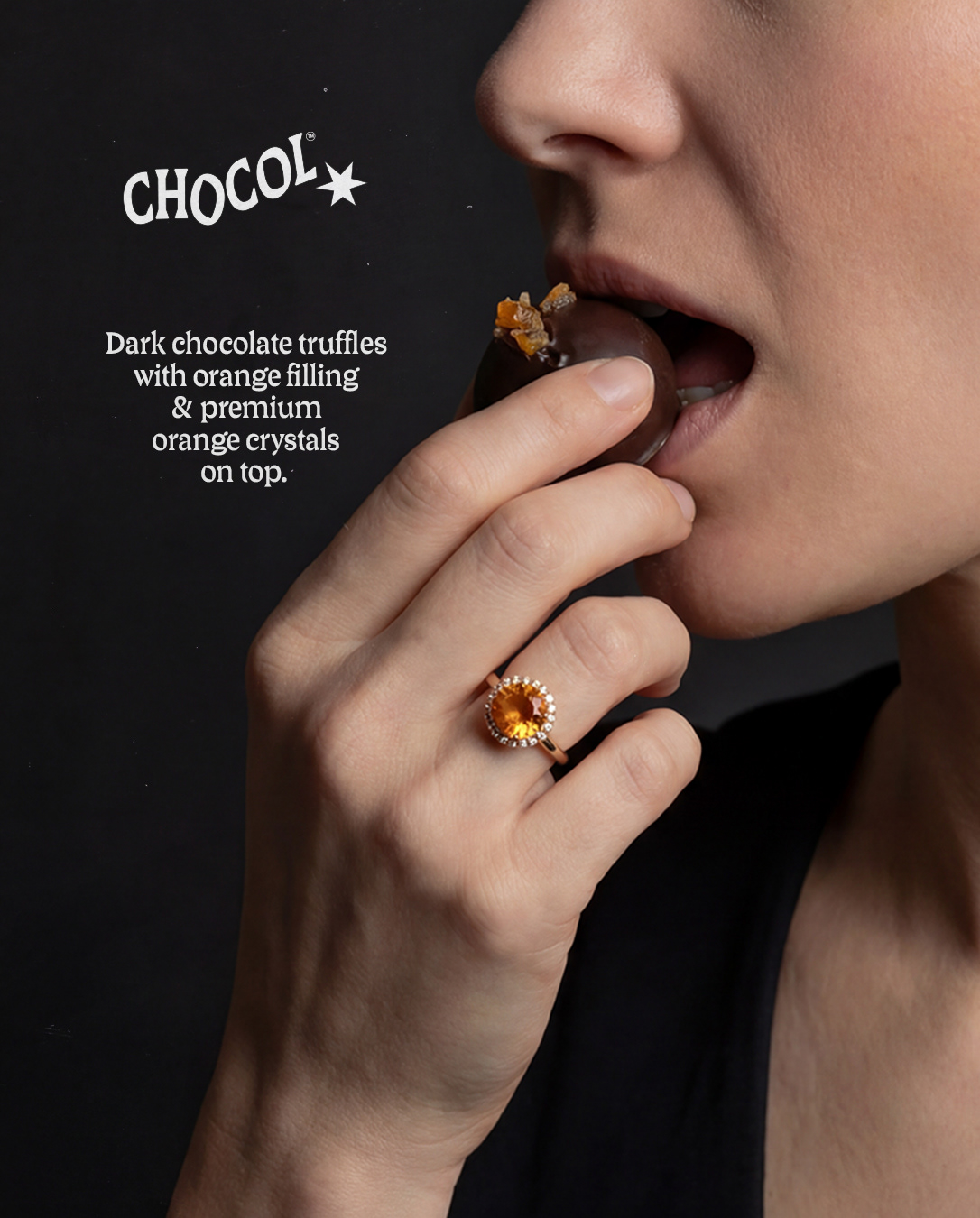
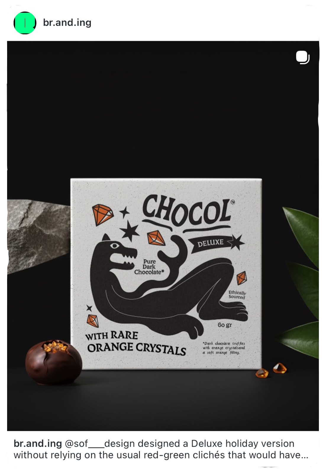
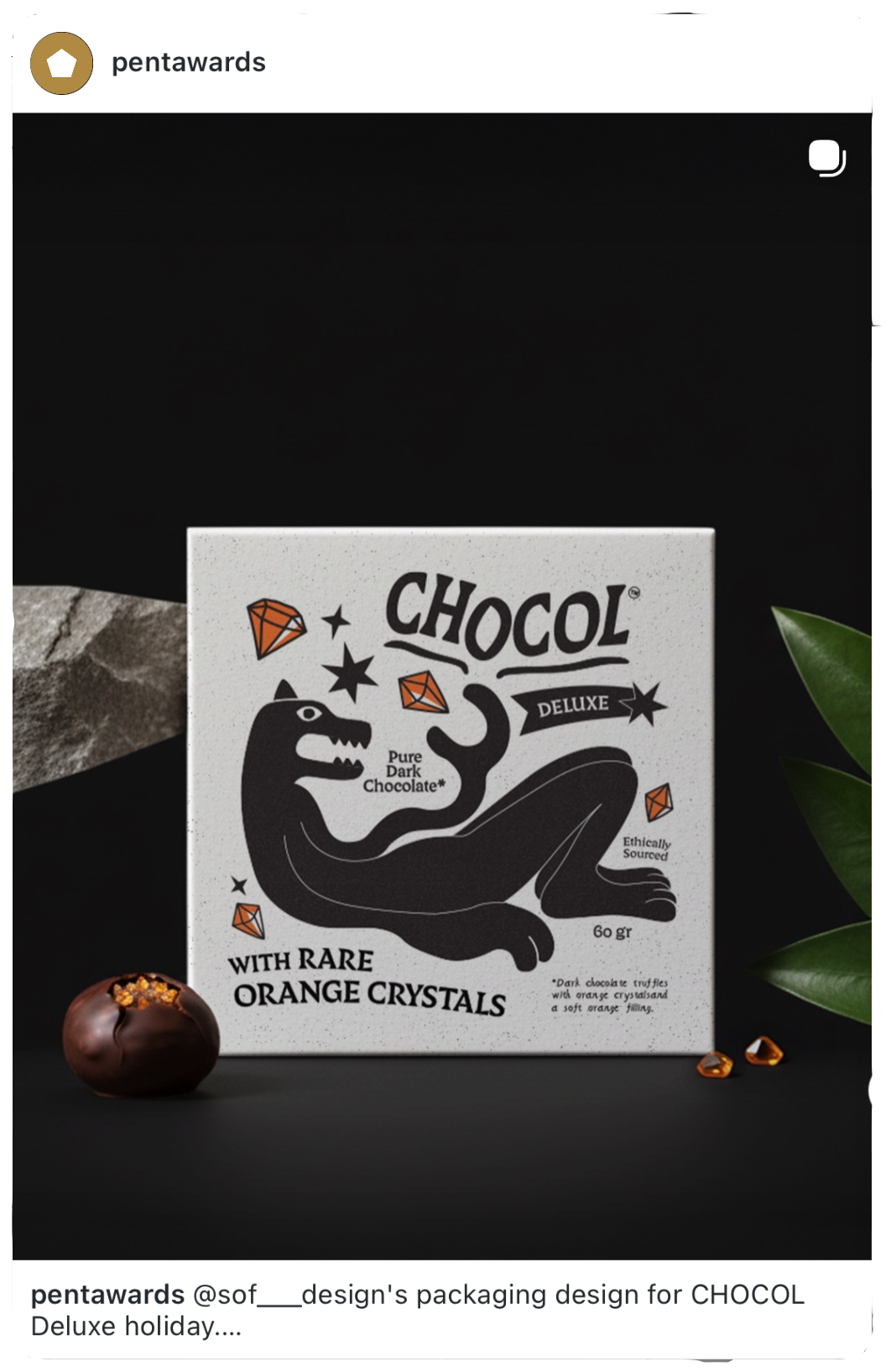
No red, no green, no seasonal clichés. Instead, I pushed the existing visual language further: the same core palette of black, white, and orange, a reimagined jaguar in a more relaxed pose, and a refined product concept, a gift box of dark chocolate truffles with orange filling and candied orange crystals. Those crystals became the central visual motif of the whole packaging system.
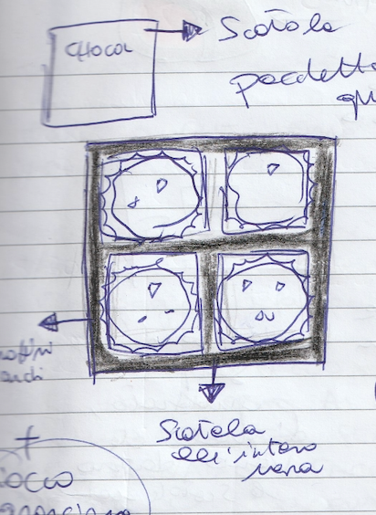
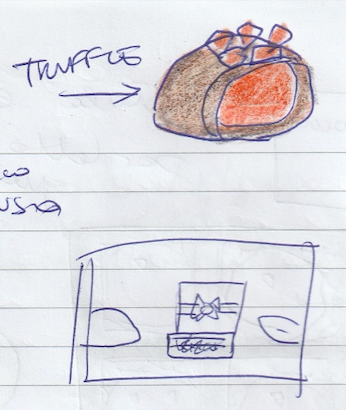
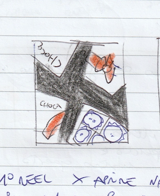

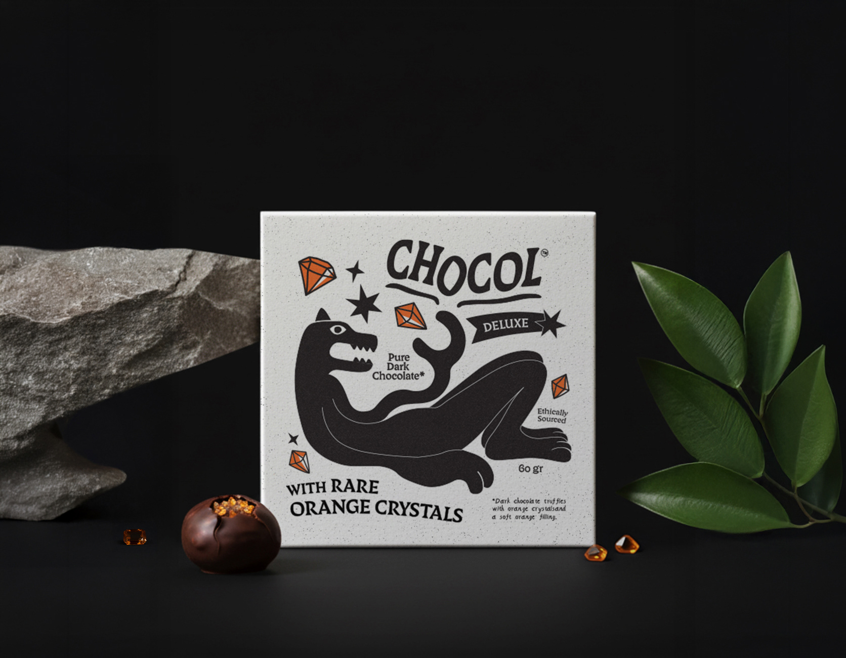
Stylistic direction was about holding two things in tension: boldness and restraint.
The black-and-white base keeps the packaging sleek and premium, while the sharp orange accents do the heavy lifting activating the jaguar illustration and giving the design its character. The typography stays deliberately minimal to let the visual elements breathe.
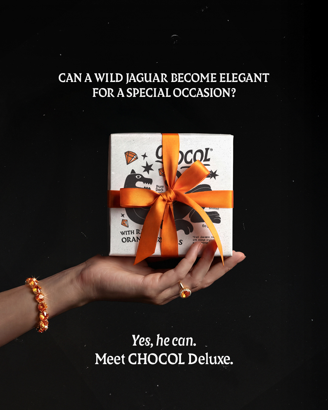
The project gained organic traction within the design community, being shared by recognised industry pages including Pentawards.
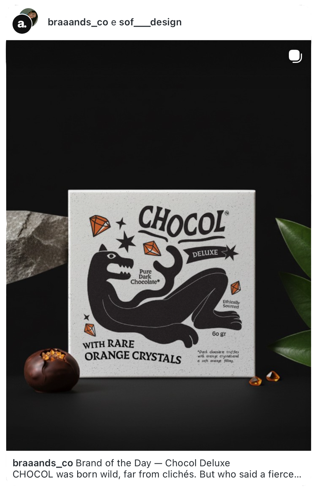

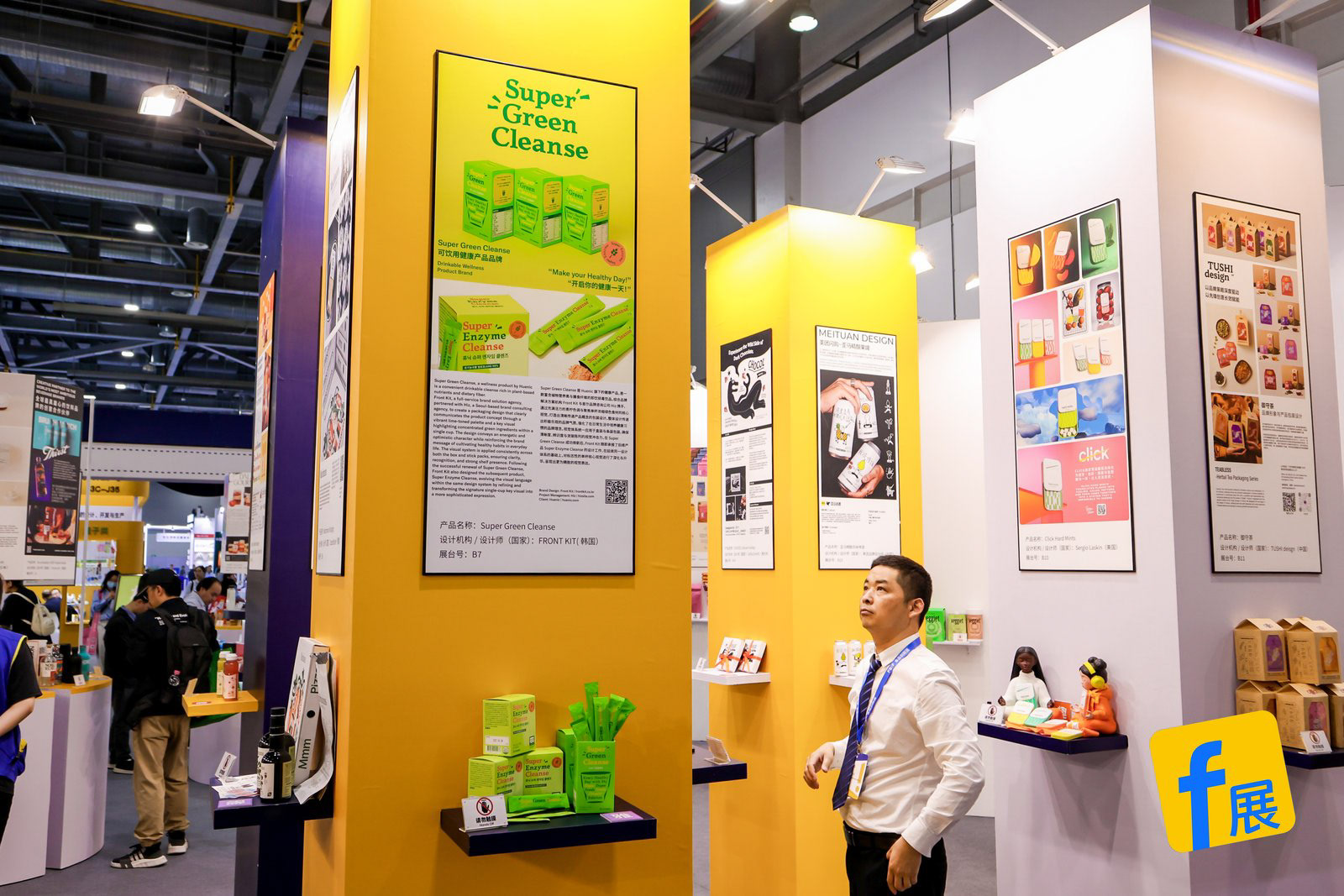
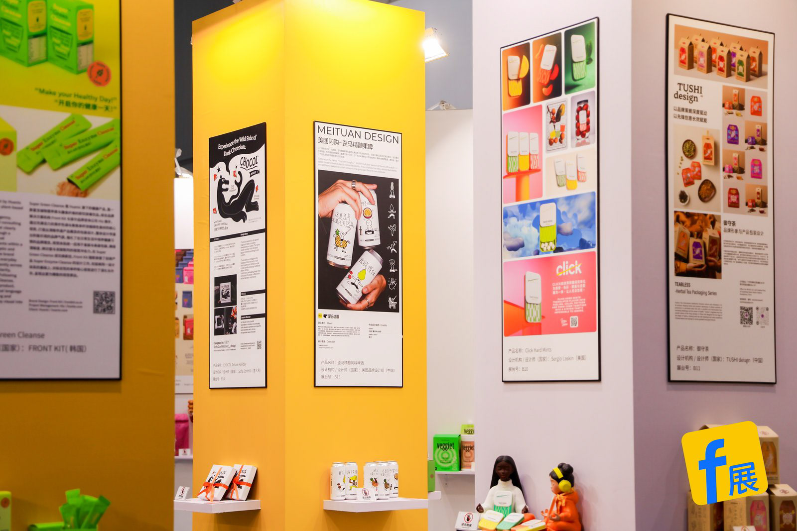
Chocol Deluxe was selected for FBIF 2026, the international food and beverage innovation forum held in Shanghai, as part of the Food Packaging Expo. A recognition that made this personal project feel like something larger, and proof that a concept built from creative instinct can travel further than expected.